Lewis Bush

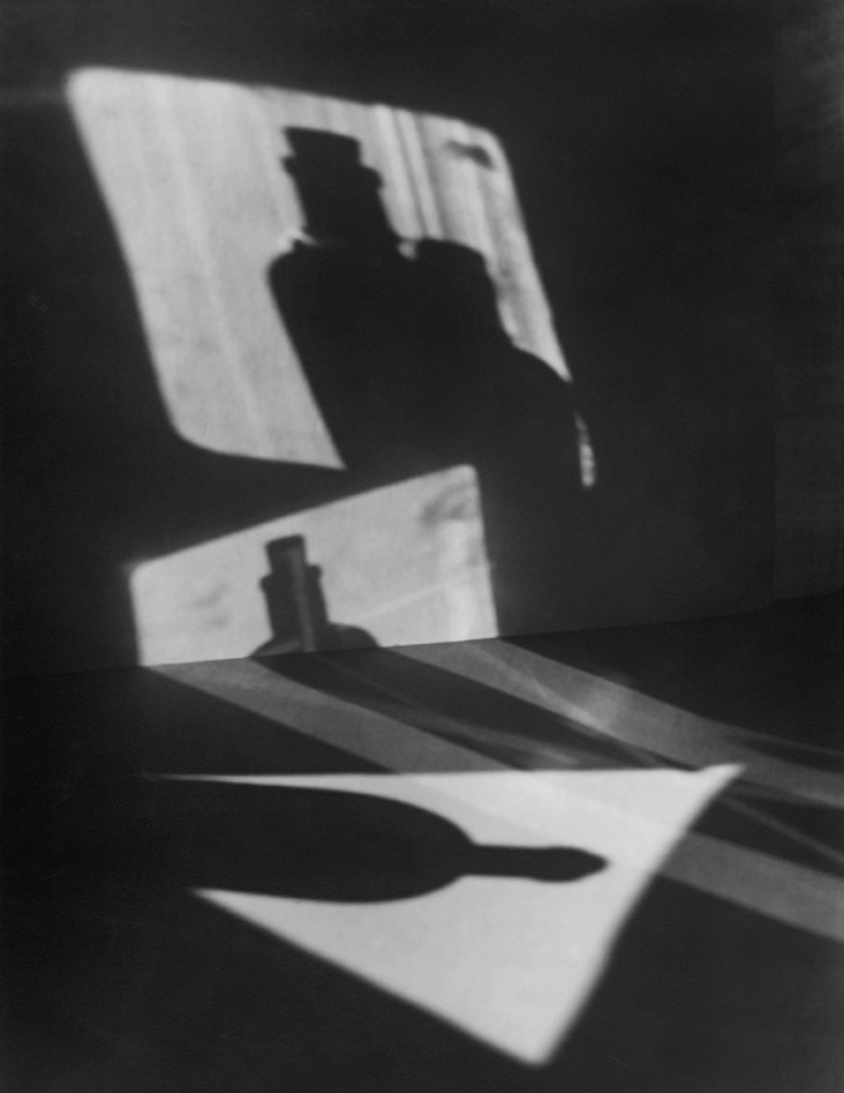
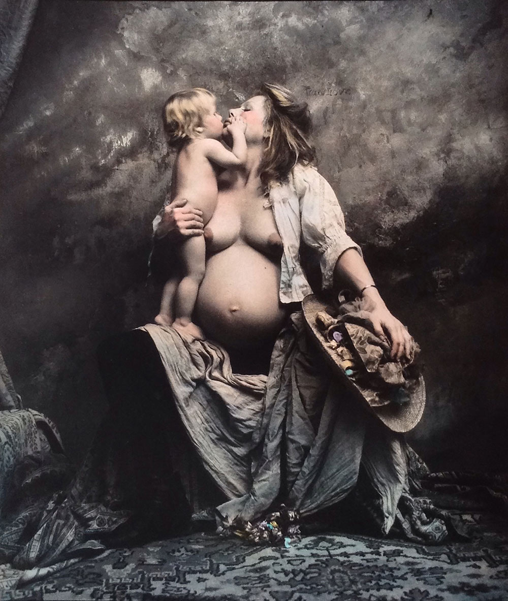
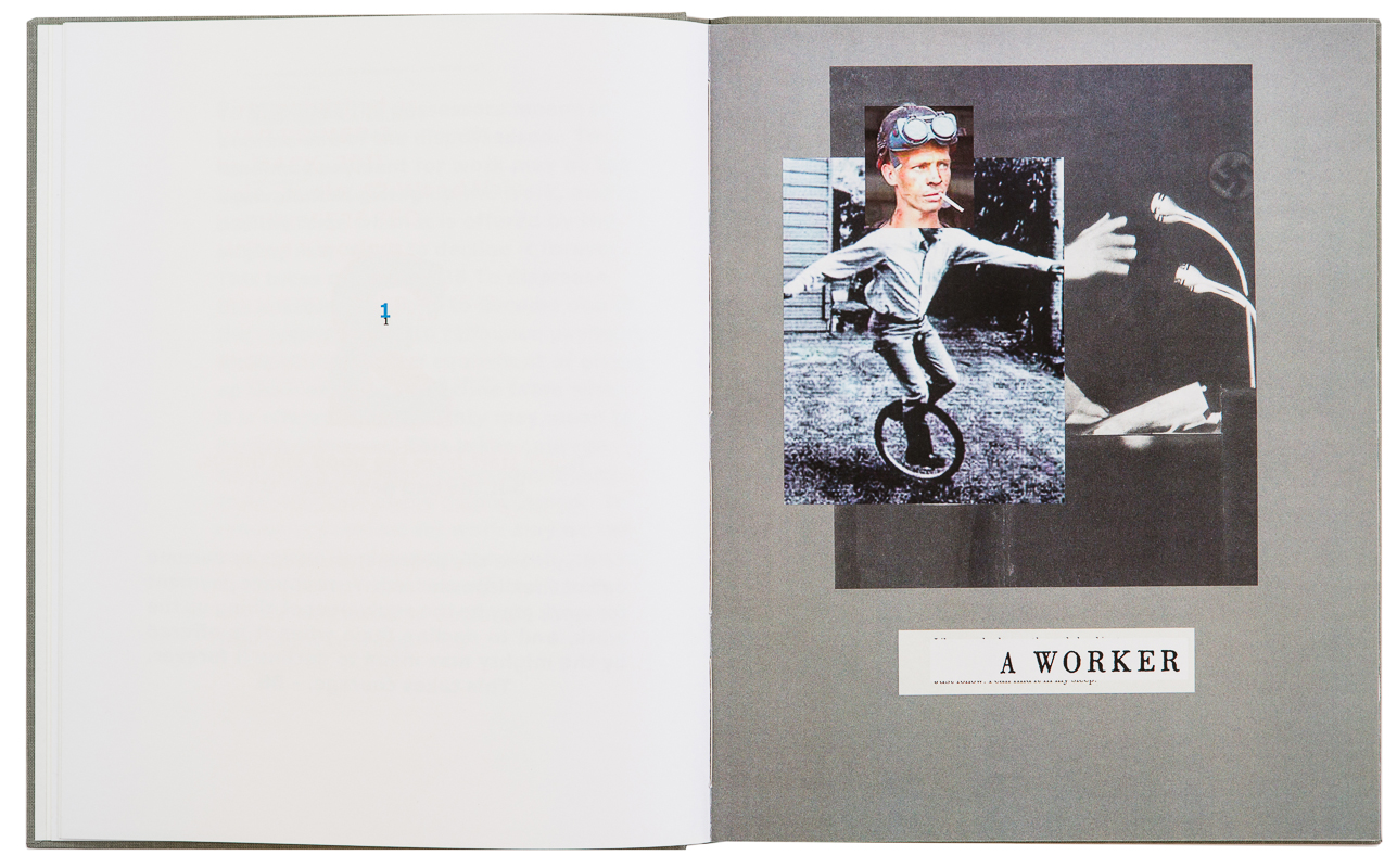
War Primer 3: Work Primer (self-published, 2015)

War Primer 3: Work Primer by Lewis Bush is a reworking of Adam Broomberg and Oliver Chanarin’s War Primer 2, itself a reworking of the 1998 English edition of Bertolt Brecht’s Kriegsfibel.
In this unique examination of war and photography, Brecht sought to extract the hidden meanings behind images of conflict with short poems modeled on the funerial epigrams of the ancient world. Broomberg and Chanarin in turn updated Brecht’s book by introducing images from the War on Terror, each intended to resonate with Brecht’s original text. While in some respects brilliant, in other ways Broomberg and Chanarin’s followup was also deeply problematic.

This slideshow requires JavaScript.

In response to these concerns, and in the spirit of Brecht’s playful invocation not to ‘start with the good old things but the bad new ones’ Bush decided to rework Broomberg and Chanarin’s book into a work primer, a meditation on inequality, labour and capital. By “restructing” the book around the text of his poem A Worker Reads History, and adding new images and text to those added by Broomberg and Chanarin, Bush sought to produce a book which would be a small tribute to the unacknowledged workers, labourers, and slaves who keep the engines of the world turning.

Paola Paleari: You’re a writer and a photographer rather than a photo-based artist. Why did you feel the urge of re-making War Primer 2? Should War Primer 3 be considered more as a creative act or as a statement of claim?

Lewis Bush: Without getting too deep into the backstory behind War Primer 3, which can be read about on my site, I made the book because I wanted to make a point about the way politics is often appropriated in an inconsistent or incompatible way by artists. Politics, of a very particular sort, seems to have become a trendy, saleable commodity for many artists, not something they employ and champion through their work because they believe in it. Indeed to be a political artist today is quite often seen as being rather naive.
In this sense, War Primer 3 is certainly a statement of a sort, hopefully it can also be seen as a creative act. That though is much more down to the individual viewer and it is interesting to hear the reactions of different people to the work. There remain a significant number of people for whom “photography” still means to actually take photographs, and to whom War Primer 3 is not at all creative, but rather plagiaristic. I’m glad to say they seem to be increasingly in the minority, and more and more people seem open to the idea that one can be a creative photographer without ever touching a camera.

War-Primer-3-book-by-Lewis-Bush-4

PP: In War Primer 3, the aspect of appropriation, which is often embedded in artistic practices that deal with archival material, is put under examination. What is your point of view on this kind of action?

LB: Appropriation is a problematic practice, and I say that even if I have made extensive use of it. Putting aside the legal aspects, when you engage in appropriation there are all sorts of ethical issues you have to consider about whose work you are appropriating, and what wider good or bad your use of those images might be doing. With War Primer 3 I rationalised the act of appropriation in that I felt the problem of appropriating imagery and using in the book was maybe outweighed by the case the book had to make. I’m sure some would disagree with that, but that is how I rationalised it to myself.
On a rather pedantic side note, I don’t like the term “appropriation” very much, since it is loaded with certain negative connotations. There is a related word in English, “expropriation”, which is where an organisation, usually a government, appropriates private property for the public good, for example during a war or disaster. Without at all suggesting that the end justifies the means, I prefer to think of what I do as a form of expropriation, where the act of taking something over might be problematic, but it is done with the intent of achieving a wider rather than narrow good.

PP: From which sources did you draw the images you used in
War Primer 3? Which criteria did you follow in their selection and editing?

LB: The images in the book come from a very wide range of sources. As in the original two books some are press images, others are produced by campaign groups and non-governmental organisations as part of evidence gathering against exploitative work practices, several are screenshots, others are images taken by citizens and bystanders, and a few indeed are from government institutions like police forces and militaries. Returning again to the idea of appropriation, all of these different image sources present different problems when you appropriate them. In each case you’re weighing up things like the original purpose of the image, the original producer, and your intent for it, and thinking about how these things relate. Things are even more complex because the “owner” of a given image is often far more transparent.
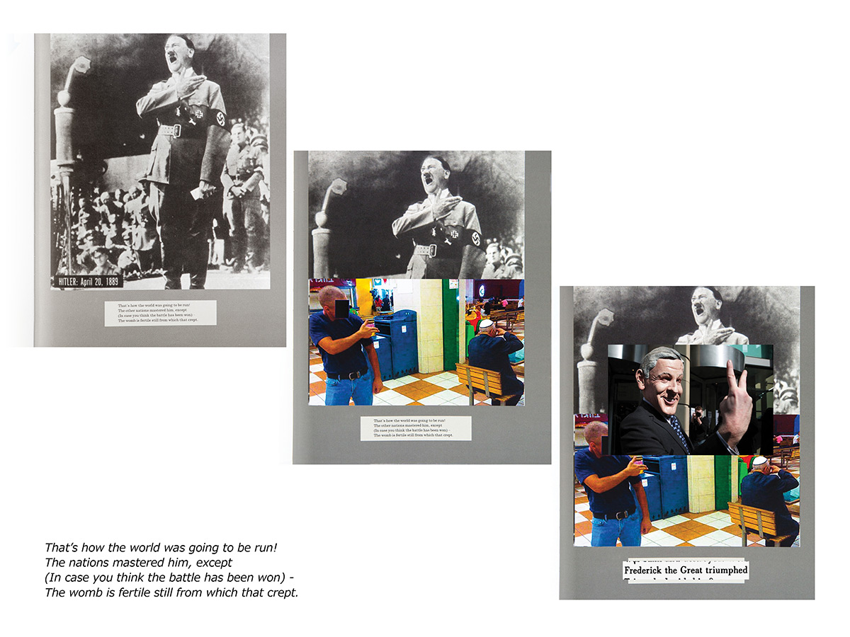
In terms of selection and editing of the images, the selection was defined by the text on each page, text drawn from Brecht’s poem A Worker Reads History. I had this bare skeleton of a narrative from very early on, and then it was just a case of searching for images and themes which resonated with both the texts and the existing images on each page. Sometimes the right image appeared very quickly, other times I would find images which were along the right lines but not quite right, and so I would keep searching and sometimes go through many very similar images searching for one that was just right. In a few cases I had to settle for one which maybe wasn’t perfect or a strong image in itself, but which facilitated the overall effect of the book.

War-Primer-3-book-by-Lewis-Bush-17

PP: Both Kriegsfibel by Brecht and War Primer 2 by Broomberg & Chanarin are constructed on the relationship between word and image. As you said, you also retraced this technique by combining new images to one of Brecht’s poems. Why did you take this decision? Do you think the photographic image that is decontextualized always needs some kind of caption to be fully understood?

LB: Rather than retain the original structure of Kriegsfibel as Broomberg and Chanarin had done for War Primer 2, I decided the narrative needed to be changed in order to reflect the change of focus I wanted the book to have. The poems in Brecht’s original book were unambiguously about war, and I wanted to talk about economics. Using one of Brecht’s other poems seemed like a good compromise between achieving what I wanted to achieve with the book while also keeping his voice at the core of it. At the same time, I hope the way text is paired back to just a handful of words also create an interesting balance between image and text, where it is unclear which is dominant, or which one of the two is explaining the other.
In terms of context, photographs always need additional information to be understood, whether that information comes in a caption or in another form. I think we remain so seduced by the photograph, so ready to believe that what we are looking at is some sort of window through space and time to another moment and place. We readily forget that a photograph is just a pattern of dark and light on a piece of paper or a monitor, and that to interpret even the most basic of information in that pattern requires all sorts of existing information which we carry around in our heads, or glean from other sources. The idea that photographs alone speak some universal language or mean the same thing to everyone who looks at them is one of the great delusions of our otherwise very visually literate culture.

[Click here to go back to Punto de Fuga]

CZECH FUNDAMENTAL

The eternal return. Recurrent patterns in Czech photography of the Twentieth century

If writer Franz Kafka is universally recognized as one of the major references in Czech literature – and culture in general – of the first half of the Twentieth century, the same can be said about novelist Milan Kundera relative to the period that starts with the famous Prague Spring and reaches to the present day. Despite the fact that the latter has lived in exile since 1975, there is a close connection between these two authors, and the influence played by Kafka was acknowledged by Kundera himself (i).
The individual’s anguish, anxiety and fears towards both the outer and inner world, the terror of an absurd bureaucratized universe, the sense of loneliness and inappropriateness are some of Kakfa’s characteristic themes that arose from the specific socio-political conditions of his times and left a permanent mark on the way his compatriots have been looking at existence. Together with Kundera, many postwar Czechoslovakian authors brought these considerations into their works and reinterpreted them through various artistic practices, sewing a fil rouge between the modernist and post-modernist ages that has given shape to a unique coherence in terms of concepts and expressive modes.

Jaromir Funke, Composition (bottle shadows), 1927. Prague House of Photography. Portfolio IV. Print III. Edition 6/30. Collection Marc Rubenstein, NYC.

Referring more precisely to photography, some fundamental patterns can be distinguished and found throughout the course of the last century, especially in the works of the avant-garde artists and in the more recent photographic experimentation from the ‘90s. The significance of void and absence is one of these traits, which led to the establishment of a strong trend towards abstraction. The heredity left by Jaromír Funke – who in the ’20s was a pioneer in his attempt of representing the “essence of vision”, using elementary geometric forms as they were the basic building-blocks of the universe – is undoubtedly the starting point of many conceptual compositions of younger generations, where the structure of the material and the light processes are analyzed through a minimalistic experimental approach.

Jiri Sigut, John Cage — Music for Marcel Duchamp, Ostrava-Poruba, 6.10.1987. Gelatin silver bromide print.

Alongside the coldness of shadows and shapes, another predominant element that runs parallel like an underground stream is the presence of human body and its intrinsic erotic power. It was an obsession and a cage for Kafka, who in The Metamorphosis (1915) turned the internal rage at his own physical weakness into alienating images of the male body, while Kundera “specialized in that brand of emotionally distanced, often farcical eroticism” (ii) that reached its highest point in The book of laughter and forgetting (1979). The body is an absolute and controversial protagonist in Czech photography since the appearance of the avant-garde movements: in the ‘20s, František Drtikol’s elegant nudes were considered extremely daring for their time, showing the naked body in its original state and natural beauty; Miroslav Tichý’s stolen portraits of women from the ‘60s placed themselves well outside of the artistic mainstream for a long time, while more recently Jan Saudek’s rich and often grotesque scenes were accused of spreading pornography.

Jan Saudek, Suzanne and her children, 1992. Hand-colored gelatin silver print.

In fact, irony is an important component of this game, as well as an inescapable characteristic of many Czech authors, accompanied by the tendency to mock stereotypes and clichés. Although often obscure and enigmatic, Czech soul is also sarcastic and playful, having developed humour in response to a cumbersome bureaucratic system that used to praise conformity and rules above individuality and free-thinking. Václav Chocola’s example is paradigmatic in this sense: a photo-reporter of some reputation of his time, he was arrested by the communist regime and spent one month in prison for his documentation of Jan Palach’s funeral in 1969, but he continued to work, producing unforgettable images. Under very different conditions but adopting a similar approach towards the weirdness of life, Slovak photographer Peter Župník – a member of the 1980s so called “New Wave” generation – unveils the poetry hidden in our world by playing with the unexpected and bizarre side of everyday situations.

Peter Zupnik, The cat that wanted to be a tiger. Hand-colored gelatin silver print.
Peter Zupnik, The cat that wanted to be a tiger

Even if in the present day we are facing an increasing flattening of visual culture due to the hyper-production of images, the Czech photographic spirit tries to survive, as if it was driven by the concept of the “eternal return” described by Kundera in The unbearable lightness of being (1984), where, in an infinite universe, everything is guaranteed to recur endlessly. This perspective surely casts an almost idealistic shade on creative production and on the role of the artist, which is put in the position of assuming the responsibility of the past on his or her shoulders, and at the same time is asked to surrender to the will of fate. Following this vision, we can apply to photography what Moravian author Jan Skácel wrote in 1966 about poetry: Poets don’t invent poems / The poem is somewhere behind / It’s been there for a long long time / The poet merely discovers it.

(i) Cfr. Milan Kundera, The Art of the Novel, Grove Press, New York, 1988
(ii) Harold Bloom, Aaron Tillman, Milan Kundera (Bloom’s Modern Critical Views), Chelsea House Publications, New York, 2003

A conversation with Fabrizio Cicero

P1030193 web

[Click here to go back to the show]

Let’s start from the end, or better from the exit. Why did you choose this title?

I had almost finished the first module you can see in the videos, many possible titles were in my head and “exit” was among them. It’s a word that has always been teasing my imagery, an everyday word that carries deep hints.
The ultimate confirmation came while I was watching Barfly, a 1987 movie with Mickey Rourke acting as an alcoholic character based on Charles Bukowski’s figure. I was appealed by the EXIT sign that persistently appears in the bar where these people, desperate and defeated by life, gather to endlessly drink, never seeing the daylight. It’s like they are stuck in a claustrophobic parallel universe, but, sooner or later, they will be forced to come out and face the reality, somehow.

Also your artworks set up a parallel universe, but its mark is pretty opposite: ethereal, otherwordly…

Yes, they are, but this is not a contradiction. An exit is always an entrance too. There’s something beyond that red sign, for sure…

The triangle. The displayed series is based on this geometric shape, a very strong element with millennial symbolic meanings. On the other hand, the triangle is quite a hype right now: in graphic, fashion, music…

Oh, yes?

Your reaction makes me smile and it’s already an answer to my next question, that is, what’s your position on this trend?

Are we talking about hipsters? They didn’t invent anything, it’s all a matter of trends coming back again and again. Let’s think about the ‘70s: the triangle influenced a whole generation.

I managed to provoke you, I see! Joking aside, I would like you talk about your personal approach to this shape, on a pure creative level and also in connection with its meaning for you.

Unfortunately – or luckily – I tend to proceed through confirmations, both in my work and in real life. It happened this time, as well.
I began this series because I wanted to release myself from the two-dimensional space. The triangle, on a practical level, seemed to me the most useful and suitable shape to build a volumetric structure. A further confirmation arrived while I was visiting my cousin, who builds artificial prosthesis: she was working at the computer and polygonal shape images formed by triangles appeared on the screen. I was curious, I asked her what they were and, by reducing the zoom, she showed me they were a graphic reconstruction of artificial bones.
I took this as an existential proof, even before a practical validation: it was like we were fully composed by triangles. I think everything can be built starting from this shape. I limited myself to the sky, for now.

05032015-P1030248 web

The atmospheric element is a counterpoint to the geometric one. While realizing Exit’s modules, when did the sky make its appearance: before, after or together with the triangle?

I started from the sky as a two-dimensional drawing. Even though, now that I think better about it, the very first “sky drawing” I made was on a series of triangular sheets I didn’t know how to use and develop. Only after some time I understood I simply had to assemble them and make them proliferate.

Indeed, you follow an opposite procedure than the one adopted in sculpture, where you start from an unicum and you remove pieces to let the detail emerge. On the contrary, you start from an atom and then add pieces to obtain the unicum…

Yes, I start from a unit, that influences all the others with its presence and, in doing so, the entire object. Moreover, the triangles are all the same dimension, so we could imagine to determine the precise surface of these sculptures by starting from the triangle’s sides. Are we daydreaming about measuring the sky, aren’t we? The conceptual mission of my work is precisely this: to calculate what is not measurable, what is immaterial. It’s always over our heads, but we can never catch and contain it in a unique vision.
After all, the choice of the sky as a subject is derived from a similar need. During the days after my mother’s death, a year ago, I found myself watching the sky very often, as I hadn’t done for a long time. When temporal life oppresses us, we look for a relief above us… in this case, I needed both to abstract from the pain and to search for my mother’s presence. That’s why I passed from sky observation to sky representation: giving it a shape and measures was like having the power to control it. It was a therapeutic action, it helped and accompanied me very much. This exhibition is dedicated to her, for sure.

Let’s switch on the influence the theatre is having on you. A couple of years ago, you started this experience [light designer for theatre shows, Author’s Note] and from that moment on your creative action has been deeply changing. Am I wrong?

It’s a process in progress and at present it’s still partly unconscious: when you deal with lights, sets, atmosphere changes, it’s difficult to come back home without being influenced.
On a rational level, I became passionate with light both technically and perceptively, or better with how it interacts with objects. Surely, this helped me to understand that it was time to emancipate myself from the two-dimensional space – that I have already explored and that was starting to bore me – and to move towards volumes. The Exit videos are my first experiment in this direction: at a certain point, it’s the no longer the artwork itself, but the light that determines the result.

We must accept to lose control…

Totally. The final effect was a surprise even to me, even though I was the one operating the source of light. The “picture of the situation” is set by the video, that becomes an independent artwork. Nothing is concluded in this process, on the contrary, we’re just at the start.

Future plans?

I’d like to continue with these skies and make them very big, passing from sculpture to installation, to scenography. I’m thinking about expansive projects, related to the places and the territory, capable to distract me from pure study.

Last question, maybe a bit weird, since we’re in a virtual context: would you ever give up the manual skill?

Never on Earth. Even when I realize videos, I’d always like they had the shade of a pencil. The pencil prevents me to be lazy.

1145 web

Dino Ignani. Dark Portraits

Screen Shot 2017-04-29 at 13.55.17

[Clicca qui per tornare alla mostra]

“Non odio nulla più delle fotografie edulcorate tramite trucchi, pose ed effetti. Quindi permettetemi di essere onesto e di raccontare la verità sulla nostra epoca e la sua gente”.
L’affermazione suona straordinariamente contemporanea. Invece fu scritta quasi cent’anni fa da August Sander, il fotografo tedesco autore della celebre ricerca Menschen des 20. Jahrhunderts (Uomini del Ventesimo Secolo). L’obiettivo di Sander era dare vita a un catalogo della società moderna attraverso una serie di ritratti fotografici neutri e obiettivi, in cui per la prima volta l’interpretazione della scena cedeva il passo alla documentazione del soggetto.
In termini di intenti, Dino Ignani non si discosta molto, nel proprio lavoro, dalla formula utilizzata a suo tempo da Sander. Pur insistendo su un fenomeno molto specifico sia in termini sociali che storici e geografici, la fotografia seriale è infatti il contesto dove meglio possiamo posizionare il progetto 80’s Dark Portraits: una raccolta di ritratti dei frequentatori ed animatori dei club dark romani effettuata con metodo, rigore e costanza. Nelle oltre quattrocento immagini collezionate, la restituzione visiva dei soggetti – così come la loro scelta – è totalmente modulare e democratica, dal momento che l’inquadratura è quasi sempre frontale, il margine lasciato allo sfondo è minimo e il tempo dedicato alla posa è lo stretto necessario.

188

Un siffatto schema visivo costringe lo spettatore a soffermarsi con la medesima attenzione su ciascuna delle persone ritratte, in modo da poter cogliere appieno quei particolari che le accumunano tutte a una certa categoria e allo stesso tempo le distinguono l’una dall’altra. E’ vero infatti che il movimento dark era connotato da dettami di stile ben precisi, quali le acconciature vistose, gli accessori esagerati, il trucco pesante e gli abiti neri, ma l’impressione fornita dall’osservazione dei vari soggetti è che ciascuno poi elaborasse le tendenze estetiche in chiave molto personale, per un bisogno di rispondenza interiore prima ancora che di esibizionismo o di accettazione collettiva. Benché il protagonista delle immagini sia il “popolo della notte” alternativo e anticonformista, scorrendo questi volti si respira un’aria spontanea e quasi ingenua, e la cosa non può non stupirci se nella nostra mente confrontiamo la ricerca in questione con il lavoro che oggigiorno più gli si avvicina, ossia il servizio fotografico che viene spesso fornito dai locali notturni. La consapevolezza di sé e la necessità di certificare la propria presenza che nei nostri tempi – complici i social network – vengono avanzate con prepotenza dal soggetto stesso, sembrano essere del tutto assenti nei ritratti di Ignani, dove pure la specificità e la particolarità di ognuno avrebbero giustificato la “presa di controllo” del momento dello scatto da parte di chi si offriva alla lente del fotografo.

221
Invece la regia rimane sempre nelle mani del fotografo, che si tiene volutamente lontano anche dalle atmosfere patinate tipiche della moda, eccezion fatta per alcuni ritratti eseguiti sempre in quegli anni all’inaugurazione di Firenze / Londra. Arte moda 1985 presso la boutique Luisa Via Roma di Firenze: qui, gli elementi creativi tipici del movimento dark appaiono già riassorbiti e riproposti in chiave più conscia e smaliziata. L’esplorazione fotografica del movimento si chiude dunque per Ignani nello stesso momento in cui prende avvio la sua ufficializzazione sociale; la scelta di riproporla ai giorni nostri – in cui lo stile di quella generazione ha fatto il giro di boa, tornando di tendenza in veste di “vintage” – è un modo per rievocare la purezza di mostrarsi e mostrare secondo verità, che appare oggi la cosa più difficile da ritrovare.